Twitter moves so fast that if you blink, you’re bound to miss something. Each minute, an estimated 40,000 tweets are sent off blindly into world on the social network. Have you ever wondered where these tiny messages are coming from, or where they’re going? Some scientists at the University of Illinois did, leading them to create some stunning maps that appeared in the peer-reviewed journal First Monday to show just how interconnected our world really is.
To create the maps, researchers analyzed the 46.7 million tweets posted between October 23 and November 30, 2012, looking specifically at those with a tagged geographic location. They also noted what languages were used, and to where Twitter replies were being sent.
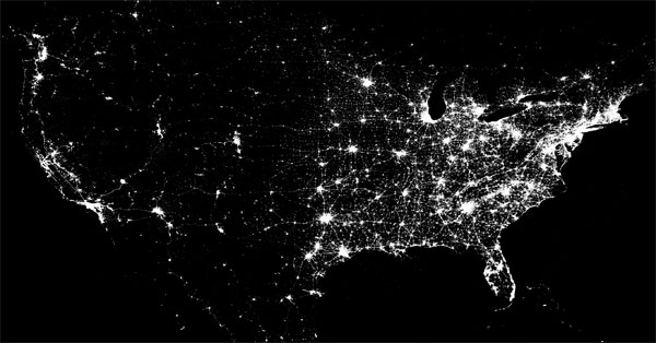
Two maps really stick out in particular. The first is a map, shown above, that charts “geographic tweet density” in the United States, with each individual tweet appearing as a tiny pinprick of light. The most tweet-dense areas, predictably, include New York, Los Angeles, Denver, and Boston – anywhere younger people are densely packed. But there are a couple of other interesting areas that stick out, like the bright smear of white that follows Interstate 85, the high-tech corridor of the South.
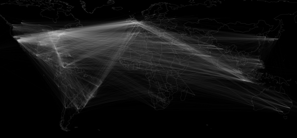
Another map shows peoples’ interactions with each other, connecting those who post a tweet with the folks who retweet them. Scientists found that the people who reply to your tweets live, on average, about 1,118 miles from you. Americans make most of their international Twitter connections with Europe (especially England), though there are some interesting connections with Indonesia and South America as well.

From Anthony Hart on May 18, 2013 :: 2:14 pm
Its very interesting to see this. I wonder how it would look if you could connect every social network on the planet.
Reply