Netflix is rolling out a redesigned interface across its TV and mobile apps. The goal: simplify navigation, streamline content discovery, and surface better recommendations. If you’ve ever felt paralyzed by choice or stuck in a loop of the same suggestions, the changes might be just what Netflix needs to shake things up. But as someone who likes to explore, not just consume, I’m taking a wait-and-see approach.
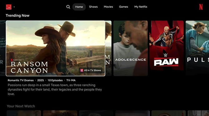
The new interface swaps a new static menu bar at the top of the TV screen for a vertical sidebar on the left. It offers quick access to Search, Home, Shows, Movies, and My Netflix. That alone should cut down on the number of clicks (or swipes) it takes to get to what you’re looking for. There’s also a revamped title preview system that kicks in as soon as you stop on a show or movie, displaying a full-screen trailer and details like genre, rating, and how long it’ll take to finish. In theory, it makes the browsing experience feel more fluid; less like a directory, and more like flipping through live channels. Whether it helps people make faster decisions or just adds more visual clutter remains to be seen.
On mobile, Netflix is making a long-overdue shift to vertical scrolling for previews. As someone who often checks Netflix on my phone while commuting or waiting in line, I’ve found the horizontal trailer previews frustrating, especially when I have to rotate the screen just to watch a clip. The new layout looks much more mobile-native, which makes sense given that well over a third of Netflix viewers watch on a mobile device.

Read more: The Battery-Powered TV That's Perfect for Tailgating or Poolside
One of the most interesting under-the-hood changes is how Netflix plans to personalize recommendations more intelligently. The company is leaning more heavily on AI-driven suggestions that analyze not only what you watch, but how you interact with the platform: what trailers you watch, the people you search for, and what you pause, rewind, or abandon altogether. That could mean more tailored picks, but it also raises a concern I’ve had for a while: the personalization bubble.
I like to see what other people are watching, even if it’s outside my usual taste. My hope is that the new recommendation engine doesn’t double down on what Netflix thinks I like and instead helps me discover what I didn’t know I’d enjoy. We already live in tightly curated digital silos. If streaming platforms only reinforce those walls, we risk missing out on the kind of serendipitous finds that make watching fun.
Read more: All of the Roku Streaming Players Compared
For now, the new interface is rolling out to a limited group of subscribers. A broader launch is expected later this year. I’ll be spending some time with the update as it becomes available to see whether it actually makes it easier to browse Netflix’s massive catalog, or if it’s just putting a new coat of paint on the same old discovery problems.
[Image credit: Netflix]